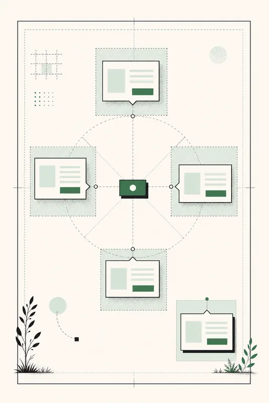
Floating UI has two separate jobs. An interaction decides when a panel opens. Positioning keeps that panel attached to a trigger while the page scrolls, resizes, and runs out of room near an edge.
The Popover API can handle open state, light dismissal, and top-layer rendering. CSS anchor positioning handles geometry. Together, they can replace a surprising amount of coordinate-measuring JavaScript, but only where your browser policy supports the positioning layer.
The code we are trying to remove
const triggerRect = trigger.getBoundingClientRect();

menu.style.insetInlineStart = `${triggerRect.left}px`;
menu.style.insetBlockStart = `${triggerRect.bottom + 8}px`;

window.addEventListener("resize", placeMenu);
window.addEventListener("scroll", placeMenu);
Production versions add more code for viewport collisions, nested scroll containers, zoom, writing modes, and a panel that changes size after it opens. Libraries solve these cases well. Anchor positioning moves the common geometry into CSS, where layout already lives.
The anchor positioning mental model
There are three parts:
- The trigger exposes an
anchor-name. - The floating element points to it with
position-anchor. - The floating element chooses a region with
position-areaor exact inset values withanchor().
.trigger {
  anchor-name: --account-trigger;
}

.menu {
  position: fixed;
  position-anchor: --account-trigger;
  position-area: block-end span-inline-end;
}
The double-dash name looks like a custom property, but it is an identifier that connects the two elements. Logical placement terms make the same rule work in left-to-right, right-to-left, and vertical writing modes.
Anchor a native popover to its button
<button
  class="account-trigger"
  popovertarget="account-menu"
>
  Account
</button>

<nav id="account-menu" class="account-menu" popover>
  <a href="/profile">Profile</a>
  <a href="/settings">Settings</a>
</nav>
.account-trigger {
anchor-name: --account;
}
.account-menu {
position: fixed;
position-anchor: --account;
position-area: block-end span-inline-end;
margin: 0.5rem 0;
}The button already controls the popover, so no click handler is needed for basic open and close behavior. CSS places the menu below the button and aligns their inline ends. Scrolling or resizing does not require another measurement pass.
Do not confuse behavior with placement. Anchor positioning does not decide whether a menu should be modal, how focus moves, or which keyboard pattern it needs. Choose the correct HTML behavior first.
Let the browser try another position
A menu below its trigger may overflow near the bottom of the viewport. position-try-fallbacks provides alternatives. The browser uses the first placement that fits within the relevant containing block.
.account-menu {
  position-area: block-end span-inline-end;
  position-try-fallbacks: flip-block, flip-inline;
}
flip-block tries the opposite block side, typically above instead of below. flip-inline mirrors the inline placement. For a specific design, define a named @position-try rule rather than accepting every automatic flip.
@position-try --above-start {
  position-area: block-start span-inline-end;
}

.account-menu {
  position-try-fallbacks: --above-start;
}
Match the anchor without reading its width
The anchor-size() function exposes dimensions from the anchor. A select-like menu can match its trigger's width without copying a pixel value into JavaScript.
.account-menu {
  inline-size: max(12rem, anchor-size(inline));
  max-inline-size: min(24rem, calc(100vw - 2rem));
}
The maximum still matters. Matching a wide anchor should not let a floating panel run beyond the viewport. Use intrinsic sizing and readable limits around the anchor-derived value.
Treat anchor positioning as an enhancement
CSS anchor positioning is not yet available in every widely used browser. Check your own analytics and support policy before removing an established positioning library. A feature query can keep a conventional placement as the baseline.
.account-menu {
						  position: fixed;
						  inset-block-start: 4.5rem;
						  inset-inline-end: 1rem;
						}

@supports (anchor-name: --trigger) {
  .account-trigger {
    anchor-name: --trigger;
  }

						  .account-menu {
						    inset: auto;
						    position-anchor: --trigger;
    position-area: block-end span-inline-end;
    position-try-fallbacks: flip-block;
  }
}
The baseline keeps the menu visible in a predictable corner, but it is not tethered to the button. If that relationship is essential in unsupported browsers, keep a tested positioning library. The native enhancement can still replace it later when your browser policy allows it.
What to verify before replacing JavaScript
- Every edge. Open the panel near all four viewport edges and inside nested scrollers.
- Zoom and large text. Content growth should trigger a usable fallback rather than cover the trigger or leave the viewport.
- Writing modes. Prefer logical areas and test right-to-left content if the product supports it.
- Interaction semantics. Keyboard controls, focus return, dismissal, and modal behavior still need the correct HTML and application logic.
- Browser policy. Keep the old positioning path until unsupported browsers have a deliberate experience.