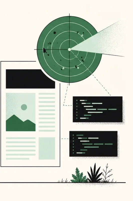
A radar is a good hero graphic. It moves without demanding attention, it suggests scanning, and it leaves room for labels. It also looks like a job for a canvas, an animated SVG, or a small script. None of those are needed.
This guide rebuilds the homepage radar one idea at a time: a square stage, rings made from borders, a sweep painted with conic-gradient(), a single rotation, labels placed with custom properties, and a final touch where each label pings as the beam passes over it. Every step is plain CSS, most of them end with a live preview of the radar so far, and the whole thing stays still for visitors who ask for less motion.
Live example: the radar you will build
@starting-stylepopover:has()light-dark()<dialog>@container
Your system asks for reduced motion, so this example stays still.
Start with honest markup
A radar holds two kinds of content. The rings, the sweep, and the center dot are decoration. The labels are information. Keep that difference in the markup: decorative layers are empty elements hidden from assistive technology, and the labels live in a real list.
<aside class="radar" aria-label="Features the scanner looks for">
<div class="radar__scope">
<span class="radar__ring radar__ring--outer" aria-hidden="true"></span>
<span class="radar__ring radar__ring--mid" aria-hidden="true"></span>
<span class="radar__ring radar__ring--inner" aria-hidden="true"></span>
<span class="radar__sweep" aria-hidden="true"></span>
<span class="radar__center" aria-hidden="true"></span>
<ul class="radar__blips">
<li class="radar__blip" style="--bx: 50%; --by: 8%"><code><dialog></code></li>
<li class="radar__blip" style="--bx: 88%; --by: 34%"><code>popover</code></li>
<li class="radar__blip" style="--bx: 79%; --by: 76%"><code>:has()</code></li>
</ul>
</div>
</aside>The outer element carries the accessible name and handles layout, such as width and spacing. The inner .radar__scope is the drawing surface every layer is positioned against. A screen reader announces the list of features and skips the rings entirely, which is what a sighted visitor takes away from the graphic too.
Make a square stage
.radar {
  inline-size: 100%;
  max-inline-size: 24rem;
}

.radar__scope {
  position: relative;
  aspect-ratio: 1;
}
aspect-ratio: 1 keeps the scope square at any width, so every ring stays a circle when the layout shrinks on a phone. There is no fixed height to maintain and no padding trick.
position: relative makes the scope the containing block for every layer. From here on, a percentage means a percentage of the radar, not of the page. That is what lets the whole graphic scale by changing a single width.
Draw the rings with borders
.radar__ring {
  position: absolute;
  border: 1px solid currentColor;
  border-radius: 50%;
}

.radar__ring--outer {
  inset: 0;
  opacity: 0.55;
}

.radar__ring--mid {
  inset: 16.5%;
  opacity: 0.35;
}

.radar__ring--inner {
  inset: 33%;
  opacity: 0.22;
}
inset sets all four edges at once. An inset of 16.5% removes 16.5% from every side, so the middle ring is 67% as wide as the radar. An inset of 33% leaves 34%. Diameters of 100%, 67%, and 34% put the rings at almost equal distances from each other and from the center, and because they are percentages, they scale with the stage.
Fading the inner rings with opacity adds depth without adding colors. currentColor makes the rings follow the text color, so a dark theme does not need a second rule.
Result so far
- Stage
- Rings
- Sweep
- Rotation
- Labels
- Entrance
- Ping
The dashed square is the stage, outlined so you can see it.
Why not one gradient? A repeating-radial-gradient() can draw every ring on a single element. Borders render crisper at one pixel, though, and separate elements let each ring keep its own opacity.
Paint the sweep with a conic gradient
A linear gradient changes color along a line. A conic gradient changes color around a center point, like the hands of a clock. Its angle starts at the top and increases clockwise, which is exactly the shape of a radar beam.
.radar__sweep {
  position: absolute;
  inset: 0;
  border-radius: 50%;
  overflow: clip;
}

.radar__sweep::before {
  content: "";
  position: absolute;
  inset: 0;
  border-radius: inherit;
  background: conic-gradient(
    from 0deg,
    transparent 0 72%,
    rgb(54 125 89 / 0.18) 92%,
    rgb(54 125 89 / 0.4) 100%
  );
}
Read the color stops as positions around the clock face:
transparent 0 72%keeps the first 72% of the turn empty, about 259 degrees. Giving one stop two positions paints a solid block instead of a fade.rgb(54 125 89 / 0.18) 92%is where a faint trail starts to appear.rgb(54 125 89 / 0.4) 100%is the brightest point. It lands back at the top of the circle.
The bright edge sits at 12 o'clock and the fading trail sits just behind it, counterclockwise. When the layer turns clockwise, the edge leads and the trail follows, which is what makes it read as a beam rather than a wedge.
Result so far
- Stage
- Rings
- Sweep
- Rotation
- Labels
- Entrance
- Ping
Dashed guides mark the color stops. Nothing moves yet.
The gradient lives on a pseudo-element for a reason: the next step rotates it while its parent stays still. The parent is round and clips it. A rotating square reaches outside its original box at the corners, and a transformed box can still add scrollable overflow to the page. overflow: clip keeps the sweep inside the circle without turning the parent into a scroll container, which overflow: hidden would do.
Rotate the sweep
@keyframes radar-sweep {
  to {
    rotate: 1turn;
  }
}

.radar__sweep::before {
  animation: radar-sweep 9s linear infinite;
}
One keyframe is enough. When from is missing, the animation starts from the element's current value, which here is no rotation at all.
1turn is 360 degrees, written in the unit that matches the intent. linear keeps the speed constant. With the default ease, the beam would slow down and speed up again at the start of every lap, and the seam would be visible.
The standalone rotate property is used instead of transform: rotate(). It combines with any transform, scale, or translate set elsewhere, so a later hover effect cannot silently overwrite the rotation.
Result so far
- Stage
- Rings
- Sweep
- Rotation
- Labels
- Entrance
- Ping
Your system asks for reduced motion, so this example stays still.
You can also leave the element still and animate the gradient's starting angle instead. That needs a registered custom property, because an unregistered one would jump from its first value to its last instead of moving between them.
@property --sweep-angle {
  syntax: "<angle>";
  inherits: false;
  initial-value: 0deg;
}

@keyframes radar-angle {
  to {
    --sweep-angle: 1turn;
  }
}

.radar__sweep::before {
  background: conic-gradient(
    from var(--sweep-angle),
    transparent 0 72%,
    rgb(54 125 89 / 0.4) 100%
  );
  animation: radar-angle 9s linear infinite;
}
Prefer rotating the layer. Animating the angle forces the browser to repaint the gradient on every frame. A rotated layer is painted once and can usually be moved without repainting, which matters for a decoration that never stops. Keep the @property version for cases where the shape itself must not turn.
Pin the center and place the labels
.radar__center {
  position: absolute;
  inset: 0;
  margin: auto;
  inline-size: 8px;
  aspect-ratio: 1;
  border-radius: 50%;
  background: rgb(54 125 89);
}
inset: 0 with margin: auto centers an absolutely positioned box once it has a size. aspect-ratio: 1 derives the height from the width, so the dot is sized in one place.
The homepage places each label with two custom properties written directly on the list item:
.radar__blips {
  margin: 0;
  padding: 0;
  list-style: none;
}

.radar__blip {
  position: absolute;
  inset-inline-start: var(--bx);
  inset-block-start: var(--by);
  translate: -50% -50%;
}

.radar__blip::before {
  content: "";
  position: absolute;
  inset-block-start: -0.5rem;
  inset-inline-start: 50%;
  inline-size: 5px;
  aspect-ratio: 1;
  border-radius: 50%;
  background: rgb(54 125 89);
  translate: -50% 0;
}

.radar__blip code {
  display: inline-block;
  padding: 0.25em 0.55em;
  border: 1px solid;
  background: Canvas;
  font-size: 0.7rem;
  white-space: nowrap;
}
Coordinates in a style attribute keep the stylesheet generic. Adding a label never means adding a selector. translate: -50% -50% centers each label on its point whatever its width, and the small dot above it is a pseudo-element, so it needs no extra markup. Canvas is the page background system color, so the labels stay readable in light and dark themes.
Percentages are easy to read but awkward to choose. On a radar, a position is naturally an angle and a distance from the center. CSS can convert one into the other with sin() and cos():
.radar__blip {
  --angle: calc(var(--turn) * 1turn);
  position: absolute;
  left: calc(50% + sin(var(--angle)) * var(--distance));
  top: calc(50% - cos(var(--angle)) * var(--distance));
  translate: -50% -50%;
}
<li class="radar__blip" style="--turn: 0.25; --distance: 36%">
<code>popover</code>
</li>--turn is the position on the clock face as a fraction of a full turn, so 0.25 is 3 o'clock. --distance is measured from the center and goes up to 50% at the outer ring. Sine moves the point sideways and cosine moves it up, which matches a clock that starts at the top and runs clockwise, just like the conic gradient.
This version uses left and top on purpose. An angle is a physical direction: 3 o'clock is on the right in every writing mode, while inset-inline-start would flip in a right-to-left page. The turn is also stored as a plain number rather than an angle, because a later step reuses the same number as a time.
Result so far
@starting-stylepopover:has()light-dark()<dialog>@container
- Stage
- Rings
- Sweep
- Rotation
- Labels
- Entrance
- Ping
Dashed guides show the angle and distance of each label.
Stagger the entrance
@keyframes radar-blip-in {
  from {
    opacity: 0;
    scale: 0.85;
  }
}

.radar__blip {
  animation: radar-blip-in 0.5s ease backwards;
  animation-delay: calc(0.2s + var(--i) * 0.3s);
}
The homepage writes six :nth-child() rules with delays of 0.2s, 0.5s, 0.8s, and so on. An index custom property, such as style="--i: 3", produces the same timing from one declaration and keeps working when a seventh label arrives.
backwards is the keyword that makes this work. It applies the first keyframe during the delay. Without it, every label would render immediately, vanish when its delay ends, then fade back in. Declare animation-delay after the animation shorthand, because the shorthand resets it.
Result so far
@starting-stylepopover:has()light-dark()<dialog>@container
- Stage
- Rings
- Sweep
- Rotation
- Labels
- Entrance
- Ping
Your system asks for reduced motion, so this example stays still.
Make each label ping when the beam passes
The beam and the labels do not know about each other, but they can share a clock. The brightest edge starts at 12 o'clock and needs the whole duration to complete a turn. A label at --turn: 0.25 is reached a quarter of the way through, so its ping only has to start after a quarter of the duration.
.radar {
  --radar-duration: 9s;
}

.radar__sweep::before {
  animation: radar-sweep var(--radar-duration) linear infinite;
}

.radar__blip::before {
  opacity: 0.45;
  animation: radar-ping var(--radar-duration) linear infinite;
  animation-delay: calc(var(--turn) * var(--radar-duration));
}

@keyframes radar-ping {
  0% {
    opacity: 1;
    scale: 2.4;
  }

  15%,
  100% {
    opacity: 0.45;
    scale: 1;
  }
}
Both animations read the same custom property, so changing the speed in one place keeps them aligned. The ping flashes at its first keyframe, settles by 15% of the lap, then waits for the next pass. Its resting values match the element's own styles, so nothing jumps before the beam arrives for the first time.
The two animations stay in step because they start together, share a duration, and both run at a constant speed. If you ever pause one with animation-play-state, pause both.
Result so far
@starting-stylepopover:has()light-dark()<dialog>@container
- Stage
- Rings
- Sweep
- Rotation
- Labels
- Entrance
- Ping
Watch a dot flash as the bright edge reaches it.
Respect motion preferences and themes
A graphic that never stops moving is exactly what prefers-reduced-motion exists for. Declare the animations only when the visitor has not asked for less motion:
@media (prefers-reduced-motion: no-preference) {
  .radar__sweep::before {
    animation: radar-sweep var(--radar-duration) linear infinite;
  }

  .radar__blip {
    animation: radar-blip-in 0.5s ease backwards;
    animation-delay: calc(0.2s + var(--i) * 0.3s);
  }

  .radar__blip::before {
    animation: radar-ping var(--radar-duration) linear infinite;
    animation-delay: calc(var(--turn) * var(--radar-duration));
  }
}
Opting in this way makes the calm version the default. With reduced motion, the radar becomes a still figure: rings, a beam resting at 12 o'clock, and every label visible. Only the movement is lost, never the content.
To follow a theme, replace the fixed green with a token and let color-mix() produce the transparent steps:
.radar {
  --radar-accent: rgb(54 125 89);
}

.radar__sweep::before {
  background: conic-gradient(
    from 0deg,
    transparent 0 72%,
    color-mix(in srgb, var(--radar-accent) 18%, transparent) 92%,
    color-mix(in srgb, var(--radar-accent) 40%, transparent) 100%
  );
}
Mixing a color with transparent changes only its opacity, so these two stops match the fixed values used earlier. A dark theme can now override --radar-accent once.
Live example: reduced motion and a new accent
@starting-stylepopover:has()light-dark()<dialog>@container
@starting-stylepopover:has()light-dark()<dialog>@container
--radar-accent, nothing elseEverything in this guide works in current versions of every major browser. Conic gradients, aspect-ratio, the standalone rotate property, and overflow: clip have been available for years. sin(), cos(), and color-mix() reached all major engines in 2023, and @property, used only in the alternative, in 2024.
The complete code
<aside class="radar" aria-label="Features the scanner looks for">
<div class="radar__scope">
<span class="radar__ring radar__ring--outer" aria-hidden="true"></span>
<span class="radar__ring radar__ring--mid" aria-hidden="true"></span>
<span class="radar__ring radar__ring--inner" aria-hidden="true"></span>
<span class="radar__sweep" aria-hidden="true"></span>
<span class="radar__center" aria-hidden="true"></span>
<ul class="radar__blips">
<li class="radar__blip" style="--turn: 0.02; --distance: 38%; --i: 0"><code>@starting-style</code></li>
<li class="radar__blip" style="--turn: 0.18; --distance: 36%; --i: 1"><code>popover</code></li>
<li class="radar__blip" style="--turn: 0.34; --distance: 28%; --i: 2"><code>:has()</code></li>
<li class="radar__blip" style="--turn: 0.5; --distance: 38%; --i: 3"><code>light-dark()</code></li>
<li class="radar__blip" style="--turn: 0.68; --distance: 30%; --i: 4"><code><dialog></code></li>
<li class="radar__blip" style="--turn: 0.84; --distance: 36%; --i: 5"><code>@container</code></li>
</ul>
</div>
</aside>.radar {
--radar-accent: rgb(54 125 89);
--radar-duration: 9s;
inline-size: 100%;
max-inline-size: 24rem;
}
.radar__scope {
position: relative;
aspect-ratio: 1;
}
.radar__ring {
position: absolute;
border: 1px solid currentColor;
border-radius: 50%;
}
.radar__ring--outer {
inset: 0;
opacity: 0.55;
}
.radar__ring--mid {
inset: 16.5%;
opacity: 0.35;
}
.radar__ring--inner {
inset: 33%;
opacity: 0.22;
}
.radar__sweep {
position: absolute;
inset: 0;
border-radius: 50%;
overflow: clip;
}
.radar__sweep::before {
content: "";
position: absolute;
inset: 0;
border-radius: inherit;
background: conic-gradient(
from 0deg,
transparent 0 72%,
color-mix(in srgb, var(--radar-accent) 18%, transparent) 92%,
color-mix(in srgb, var(--radar-accent) 40%, transparent) 100%
);
}
.radar__center {
position: absolute;
inset: 0;
margin: auto;
inline-size: 8px;
aspect-ratio: 1;
border-radius: 50%;
background: var(--radar-accent);
}
.radar__blips {
margin: 0;
padding: 0;
list-style: none;
}
.radar__blip {
--angle: calc(var(--turn) * 1turn);
position: absolute;
left: calc(50% + sin(var(--angle)) * var(--distance));
top: calc(50% - cos(var(--angle)) * var(--distance));
translate: -50% -50%;
}
.radar__blip::before {
content: "";
position: absolute;
inset-block-start: -0.5rem;
inset-inline-start: 50%;
inline-size: 5px;
aspect-ratio: 1;
border-radius: 50%;
background: var(--radar-accent);
opacity: 0.45;
translate: -50% 0;
}
.radar__blip code {
display: inline-block;
padding: 0.25em 0.55em;
border: 1px solid;
background: Canvas;
font-size: 0.7rem;
white-space: nowrap;
}
@media (prefers-reduced-motion: no-preference) {
.radar__sweep::before {
animation: radar-sweep var(--radar-duration) linear infinite;
}
.radar__blip {
animation: radar-blip-in 0.5s ease backwards;
animation-delay: calc(0.2s + var(--i) * 0.3s);
}
.radar__blip::before {
animation: radar-ping var(--radar-duration) linear infinite;
animation-delay: calc(var(--turn) * var(--radar-duration));
}
}
@keyframes radar-sweep {
to {
rotate: 1turn;
}
}
@keyframes radar-blip-in {
from {
opacity: 0;
scale: 0.85;
}
}
@keyframes radar-ping {
0% {
opacity: 1;
scale: 2.4;
}
15%,
100% {
opacity: 0.45;
scale: 1;
}
}