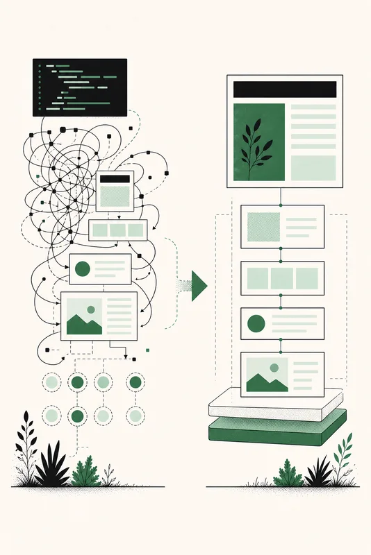
An accordion often starts as a button, a hidden panel, and a click handler. Then it gains aria-expanded, keyboard handling, a rule for closing other panels, and code to keep the visual state synchronized. The browser already has a disclosure widget that owns those basics.
The HTML <details> element contains the collapsible content. Its first <summary> child is the control people activate. This is a good match for FAQs, optional explanations, and technical information that can be hidden without blocking the task.
The custom state you can usually delete
const trigger = document.querySelector(".faq__question");
const panel = document.querySelector(".faq__answer");

trigger.addEventListener("click", () => {
  const isOpen = trigger.getAttribute("aria-expanded") === "true";

  trigger.setAttribute("aria-expanded", String(!isOpen));
  panel.hidden = isOpen;
});
This example is small, but it already has two representations of the same state. The attribute lives on the trigger while hidden lives on the panel. A native disclosure stores the state once, on the open attribute that the browser manages.
Start with the smallest correct HTML
<details>
  <summary>Can I use this without JavaScript?</summary>
  <p>Yes. The browser opens and closes this content.</p>
</details>
The summary stays visible. Activating it toggles the rest of the details content and updates the element's open state. Keyboard users can focus the summary and use the platform's normal activation key.
You can open a disclosure by default with a boolean attribute:
<details open>
  <summary>What does the audit inspect?</summary>
  <p>One rendered public page and its captured frontend code.</p>
</details>
open="false" is still open. Boolean HTML attributes are true when present, regardless of their text value. Remove the attribute to close the element.
Use name when only one answer should stay open
Giving related <details> elements the same name creates an exclusive accordion. Opening one closes the other open member of the group without a script.
<section aria-labelledby="faq-title">
  <h2 id="faq-title">Frequently asked questions</h2>

  <details name="faq">
    <summary>How long does an audit take?</summary>
    <p>Most reports arrive by email within a few minutes.</p>
  </details>

  <details name="faq">
    <summary>Does it scan private pages?</summary>
    <p>No. The page must be publicly reachable.</p>
  </details>
</section>
Exclusivity saves vertical space, but it also stops people from comparing two answers. Use name only when that tradeoff helps. Independent disclosures need no shared name.
Live example: only one answer stays open
What does details provide?
Do I need aria-expanded?
Can several panels remain open?
Style the control without erasing its meaning
The default marker is useful because it signals that the summary can expand. You can style it with ::marker, or replace it with your own visible indicator. If you remove the marker, provide another cue that changes with the state.
summary {
  display: grid;
  grid-template-columns: 1fr auto;
  gap: 1rem;
  cursor: pointer;
  list-style: none;
}

summary::after {
  content: "+";
}

details[open] summary::after {
  content: "\2212";
}
Keep a visible :focus-visible style on the summary. A custom icon is not a reason to remove the control's keyboard outline.
Native semantics remove code, not judgment
Do not add role="button" or manually mirror aria-expanded on a summary. That duplicates semantics the element already exposes and can create conflicting announcements.
Be careful with headings inside <summary>. Platform accessibility mappings have not always exposed those nested headings consistently. A separate heading for the accordion group plus plain summary text is predictable and keeps the document outline useful.
Collapsed content is also less discoverable than visible content. Browser find-in-page behavior differs, and a user may never open the panel. Do not hide essential instructions, validation errors, pricing conditions, or the only route to a task inside a disclosure by default.
Do not rebuild the widget just to animate its height
Opening and closing details is intentionally immediate in the most compatible version. New CSS primitives for the details content and intrinsic-size transitions are improving, but support and behavior still need testing across your browser matrix.
A checkbox hack or a measured-height script may produce a smoother demo while giving up the semantics and behavior that made <details> useful. Ship the native transition first. Add motion only when the effect works as an enhancement and respects reduced-motion preferences.
When <details> is the wrong element
A disclosure is not a menu, tab set, tooltip, or modal dialog. Those patterns have different focus and interaction rules. It is also a poor fit when the content must stay visible for the user to finish the current task.
- Use one summary as the first child of each details element.
- Group exclusive items inside a section with a useful heading.
- Remove
namewhen comparison matters more than saved space. - Keep a visible marker or another clear open-state indicator.
- Test focus, keyboard activation, zoom, and screen reader output on supported platforms.