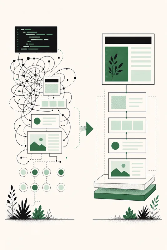
The scrolling row of logos under a hero is everywhere, and it still tends to arrive as a script: a requestAnimationFrame loop moves the row, and a bit of math resets it before anyone notices.
This guide rebuilds that ticker in CSS, one step at a time. Each step ends with a live preview. Some of those previews are broken on purpose, because the broken versions show why the final code looks the way it does.
Live example: the ticker you will build
- :has()
- @container
- popover
- <dialog>
- light-dark()
- field-sizing
Your system asks for reduced motion, so this example stays still.
Start with a real list
A ticker holds a list of things, so use a list. Screen readers can announce how many items it has and move through them one by one, even if the visual version never stops.
<section class="marquee" aria-label="Features we cover">
<ul class="marquee__group">
<li>:has()</li>
<li>@container</li>
<li>popover</li>
<li><dialog></li>
<li>light-dark()</li>
<li>field-sizing</li>
</ul>
</section>Logos work the same way. Put an <img> with alt text in each item, and give it width and height attributes so the row has its final size before the images load.
Put everything on one row
.marquee {
  --gap: 1rem;
  display: flex;
  gap: var(--gap);
  overflow: hidden;
}

.marquee__group {
  display: flex;
  flex: none;
  justify-content: space-around;
  gap: var(--gap);
  min-inline-size: 100%;
  margin: 0;
  padding: 0;
  list-style: none;
}

.marquee__group > li {
  flex: none;
}
Three declarations do the real work here:
flex: nonestops the list from shrinking, so it can be wider than the ticker.min-inline-size: 100%makes a short list at least as wide as the ticker. You will see why once there are two copies.justify-content: space-aroundspreads the items when there is room left, with half a space at each end. That keeps the spacing even when two lists sit side by side.
overflow: hidden crops whatever does not fit.
Result so far
- :has()
- @container
- popover
- <dialog>
- light-dark()
- field-sizing
- Row
- Slide
- Copy
- Seam
- Fade
- Pause
- Still
The dashed line marks the list. On a narrow screen, it runs past the edge and gets cropped.
Slide the row
.marquee__group {
  animation: marquee 20s linear infinite;
}

@keyframes marquee {
  to {
    translate: -100%;
  }
}
A percentage in translate refers to the element's own size, so -100% always means exactly one list width. There is nothing to measure. If the content changes or the phone rotates, the distance updates by itself, which is the part that takes a resize listener in JavaScript.
linear keeps the speed constant. With any easing, the row would slow down and speed up around each restart, and that rhythm is easy to spot.
Result so far
- :has()
- @container
- popover
- <dialog>
- light-dark()
- field-sizing
- Row
- Slide
- Copy
- Seam
- Fade
- Pause
- Still
Broken on purpose: the list leaves, nothing replaces it, and it snaps back at the end of each lap. This preview runs faster than the code above.
Your system asks for reduced motion, so this example stays still.
Add a second copy
The row needs something to follow it. Repeat the list right after the first one, and hide the copy from assistive technology so nobody hears every item twice:
<section class="marquee" aria-label="Features we cover">
  <ul class="marquee__group">
    <li>:has()</li>
    <!-- ... -->
  </ul>
  <ul class="marquee__group" aria-hidden="true">
    <li>:has()</li>
    <!-- ... -->
  </ul>
</section>
Both lists now move together. When the first has gone, the second sits where the first started, the animation restarts, and the two frames look the same. That is the whole trick.
It also explains min-inline-size: 100%. Each list is at least as wide as the ticker, so two copies can always cover it, however short the content is.
Result so far
- :has()
- @container
- popover
- <dialog>
- light-dark()
- field-sizing
- Row
- Slide
- Copy
- Seam
- Fade
- Pause
- Still
Keep watching for a few seconds: something is still wrong. The gap is wider here so you can catch it.
Your system asks for reduced motion, so this example stays still.
Close the seam
Each lap ends with a small jump. -100% covers one list, but the second list starts one gap further along, so the row restarts too early. Add the gap to the distance:
@keyframes marquee {
  to {
    translate: calc(-100% - var(--gap));
  }
}
Custom properties work inside keyframes. The value is read on the element being animated, so --gap comes straight from .marquee.
Result so far
- :has()
- @container
- popover
- <dialog>
- light-dark()
- field-sizing
- Row
- Slide
- Copy
- Seam
- Fade
- Pause
- Still
Same speed and same gap as the previous preview, and the loop no longer shows.
Your system asks for reduced motion, so this example stays still.
Fade the edges
.marquee {
  mask-image: linear-gradient(
    to right,
    transparent,
    #000 8%,
    #000 92%,
    transparent
  );
}
A mask reads the gradient's transparency, not its color. Where the gradient is opaque the row shows, and where it is transparent the row disappears. Unlike a gradient laid over the row, it does not have to match the page behind it, so it works in both themes and on top of images.
Result so far
- :has()
- @container
- popover
- <dialog>
- light-dark()
- field-sizing
- Row
- Slide
- Copy
- Seam
- Fade
- Pause
- Still
Your system asks for reduced motion, so this example stays still.
Add a pause control
A row that moves forever has to be stoppable. WCAG 2.2 success criterion 2.2.2 asks for a way to pause, stop, or hide anything that starts moving on its own, lasts more than five seconds, and sits alongside other content.
Pausing on hover is a nice touch, but it does nothing on a touch screen. A checkbox works everywhere and needs no script:
<div class="marquee-wrap">
  <section class="marquee" aria-label="Features we cover">
    <!-- both lists -->
  </section>
  <label class="marquee-pause">
    <input type="checkbox" />
    Pause animation
  </label>
</div>
.marquee:hover .marquee__group,
.marquee:focus-within .marquee__group,
.marquee-wrap:has(.marquee-pause input:checked) .marquee__group {
animation-play-state: paused;
}animation-play-state resumes from the same spot, so the row does not jump when it starts again. The selectors target both lists, which keeps them in step. :focus-within matters once the items are links, as you will see below.
Result so far
- :has()
- @container
- popover
- <dialog>
- light-dark()
- field-sizing
- Row
- Slide
- Copy
- Seam
- Fade
- Pause
- Still
Your system asks for reduced motion, so this example stays still.
Stay still for reduced motion
An endless loop is exactly what prefers-reduced-motion exists for. Stopping the animation is not enough, though: the row would freeze with part of the list cropped. Show everything instead. Wrap the items, remove the copy, and hide the checkbox, since there is nothing left to pause:
@media (prefers-reduced-motion: reduce) {
.marquee {
mask-image: none;
}
.marquee__group {
flex: auto;
flex-wrap: wrap;
justify-content: center;
animation: none;
}
.marquee__group[aria-hidden="true"],
.marquee-pause {
display: none;
}
}Result so far
- :has()
- @container
- popover
- <dialog>
- light-dark()
- field-sizing
- Row
- Slide
- Copy
- Seam
- Fade
- Pause
- Still
Shown to everyone here, so you can see what reduced motion looks like. Every item stays visible on a narrow screen.
If the items are links
A ticker of headlines or customer stories has links in it, and that changes three details.
- Keep the copied links clickable but out of the tab order.
aria-hidden="true"does not stop a link from taking focus, so addtabindex="-1"to each one. Avoidinerthere: it would also block clicks, and half the time the copy is what sits under the cursor. :focus-withinin the pause rule stops the row as soon as a keyboard user reaches a link, so the link does not slide away.- Keep
overflow: hiddenrather thanoverflow: clip. Withhidden, the browser can scroll a focused link into view. Withclip, it can stay outside the ticker.
<ul class="marquee__group" aria-hidden="true">
<li><a href="/stories/first" tabindex="-1">First story</a></li>
<li><a href="/stories/second" tabindex="-1">Second story</a></li>
</ul>Tune speed and direction
The duration sets the time for one lap, so with the same duration, a longer list moves faster. To keep several tickers at a similar speed, derive the duration from the number of items:
.marquee {
--items: 6;
--duration: calc(var(--items) * 3s);
}
.marquee__group {
animation: marquee var(--duration) linear infinite;
}animation-direction: reverse plays the same keyframes backward, which is all a second row needs to move the other way:
.marquee--reverse .marquee__group {
animation-direction: reverse;
}Live example: two rows, opposite directions
- :has()
- @container
- popover
- <dialog>
- light-dark()
- field-sizing
- subgrid
- @layer
- @scope
- oklch()
- text-wrap
- inert
Your system asks for reduced motion, so this example stays still.
Right-to-left pages need one more change. The row starts on the right there, so the copy sits on the left and the distance has to flip:
.marquee {
--shift: calc(-100% - var(--gap));
}
.marquee:dir(rtl) {
--shift: calc(100% + var(--gap));
}
@keyframes marquee {
to {
translate: var(--shift);
}
}What this replaces
Here is the kind of script you can now delete:
const track = document.querySelector(".ticker-track");
let offset = 0;
function tick() {
offset -= 0.5;
if (-offset >= track.scrollWidth / 2) offset = 0;
track.style.transform = `translateX(${offset}px)`;
requestAnimationFrame(tick);
}
requestAnimationFrame(tick);That loop runs on the main thread, so a long task makes the row stutter. Its speed depends on the screen, since 0.5px per frame is twice as fast at 120Hz as at 60Hz. It ignores the visitor's motion setting, and pausing it takes more code. A CSS animation of translate is based on time, can run on the compositor, and gets a pause control and a reduced-motion version from the few declarations above.
Keep the script if visitors can drag the row. CSS animations have no way to follow a pointer.
What about the marquee element? It still renders, but MDN lists <marquee> as deprecated and recommends CSS animations instead.
CSS Radar flags tickers that run on setInterval or requestAnimationFrame and shows a keyframe replacement with pause and reduced-motion states.
The complete code
<div class="marquee-wrap">
<section class="marquee" aria-label="Features we cover">
<ul class="marquee__group">
<li>:has()</li>
<li>@container</li>
<li>popover</li>
<li><dialog></li>
<li>light-dark()</li>
<li>field-sizing</li>
</ul>
<ul class="marquee__group" aria-hidden="true">
<li>:has()</li>
<li>@container</li>
<li>popover</li>
<li><dialog></li>
<li>light-dark()</li>
<li>field-sizing</li>
</ul>
</section>
<label class="marquee-pause">
<input type="checkbox" />
Pause animation
</label>
</div>.marquee {
--gap: 1rem;
--items: 6;
--duration: calc(var(--items) * 3s);
--shift: calc(-100% - var(--gap));
display: flex;
gap: var(--gap);
overflow: hidden;
mask-image: linear-gradient(
to right,
transparent,
#000 8%,
#000 92%,
transparent
);
}
.marquee:dir(rtl) {
--shift: calc(100% + var(--gap));
}
.marquee__group {
display: flex;
flex: none;
justify-content: space-around;
gap: var(--gap);
min-inline-size: 100%;
margin: 0;
padding: 0;
list-style: none;
animation: marquee var(--duration) linear infinite;
}
.marquee__group > li {
flex: none;
}
.marquee:hover .marquee__group,
.marquee:focus-within .marquee__group,
.marquee-wrap:has(.marquee-pause input:checked) .marquee__group {
  animation-play-state: paused;
}
@keyframes marquee {
to {
translate: var(--shift);
}
}
@media (prefers-reduced-motion: reduce) {
  .marquee {
    mask-image: none;
  }

  .marquee__group {
    flex: auto;
    flex-wrap: wrap;
    justify-content: center;
    animation: none;
  }

  .marquee__group[aria-hidden="true"],
  .marquee-pause {
    display: none;
  }
}